
Enterprise AI Measurement Guide
Reliability
MTTA Trend Chart
How has MTTA changed week by week over the selected period, and what does the trend chart show beyond the current-period average?
What it shows
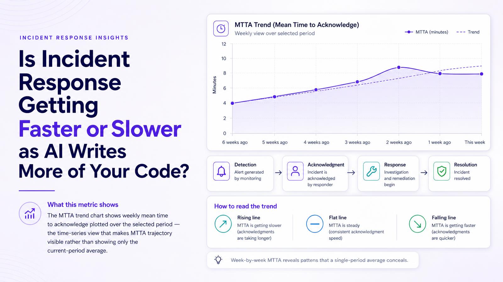
The MTTA trend chart shows weekly mean time to acknowledge plotted over the selected period, the time-series view that makes MTTA trajectory visible rather than showing only the current-period average. Week-by-week MTTA reveals patterns that a single-period average conceals: a team whose MTTA is steady at 8 minutes but was 4 minutes six weeks ago is in a different position than a team whose MTTA has been stable at 8 minutes for three months.
Why it matters
The MTTA trend chart is the investigation tool for the MTTA card. When the headline MTTA number moves, the trend chart shows when it moved, enabling engineering leaders to correlate MTTA changes with specific events: a new agent rollout, a team restructure, a change in on-call rotation, or a period of unusually high deployment frequency. Without the weekly trend, MTTA is a current-state number; with it, it becomes a causal investigation tool.
The Larridin angle
Larridin plots weekly MTTA continuously rather than as period-over-period comparisons, which means seasonal patterns, sprint boundary effects, and one-time spikes are all visible in context. A single bad week in MTTA that coincides with a major AI agent migration is a different finding from a sustained MTTA deterioration that tracks the AI adoption curve over multiple months.
Related Reliability Metrics
Common questions
What does the MTTA trend chart show?
The MTTA trend chart displays the weekly mean time to acknowledge incidents over a selected period, revealing patterns that a single-period average might not show.
Why is the MTTA trend chart important for engineering leaders?
It helps correlate changes in MTTA with specific events like new agent rollouts or team changes, providing insights beyond the current-state number.
How does Larridin's approach to plotting MTTA differ?
Larridin plots MTTA continuously, allowing for the visibility of seasonal patterns, sprint boundary effects, and one-time spikes in context.
Can the MTTA trend chart help identify the impact of AI coding tool rollouts?
Yes, it can correlate changes in incident acknowledgment times with specific workflow changes, including AI coding tool rollouts.