
Enterprise AI Measurement Guide
CI/CD
CI Run Outcomes Chart
Which CI workflows are generating the most failures or cancellations, and when did those patterns emerge?
What it shows
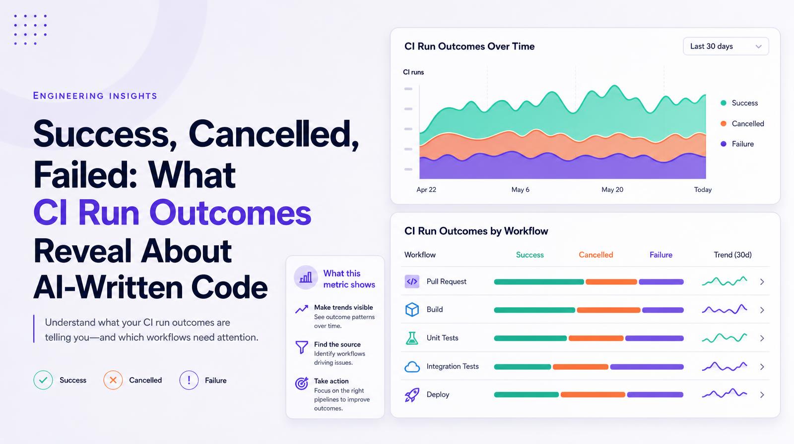
The CI Run Outcomes chart shows the count of CI runs over time broken into three outcome categories, Success, Cancelled, and Failure, and drillable by workflow. The time series makes trends visible across the selected window; the workflow breakdown identifies which specific pipelines are driving failure or cancellation patterns, enabling targeted remediation rather than org-wide policy responses.
Why it matters
The workflow-level breakdown is the diagnostic layer that turns the CI Success Rate percentage into an actionable finding. A 10% failure rate concentrated entirely in one workflow is a very different governance problem from a 10% failure rate distributed evenly across twenty workflows. The first is a targeted fix; the second is a systemic quality signal. In AI-assisted engineering environments, failure patterns often emerge first in the workflows where agents are most heavily used, making the by-workflow view the leading indicator for which AI-assisted processes need additional review or testing investment.
The Larridin angle
The over-time chart combined with the by-workflow breakdown means engineering leaders can identify not just which workflows fail but when they started failing, correlating CI outcome degradation with specific agent adoption rollouts, tooling changes, or team changes without requiring manual incident log review.
Related CI/CD Metrics
Common questions
What does the CI Run Outcomes chart display?
The CI Run Outcomes chart displays the count of CI runs over time, categorized into Success, Cancelled, and Failure outcomes, and is drillable by workflow.
Why is the workflow-level breakdown important for the C-suite?
The workflow-level breakdown helps identify whether a failure rate is concentrated in specific workflows or distributed across many, guiding targeted remediation or indicating systemic issues.
How can the CI Run Outcomes chart aid in managing AI-assisted engineering environments?
The chart can reveal failure patterns in workflows heavily using AI, serving as an early indicator for areas needing additional review or testing investment.
How does the chart help correlate CI outcome changes with AI coding changes?
By showing when specific workflows started failing, the chart helps correlate CI outcome degradation with agent rollouts, tooling, or team changes without manual incident log reviews.