
Enterprise AI Measurement Guide
Velocity
Team Level Breakdown
How do we see each engineer's Total, Average, and weekly Output score in the Velocity tab?
What it shows
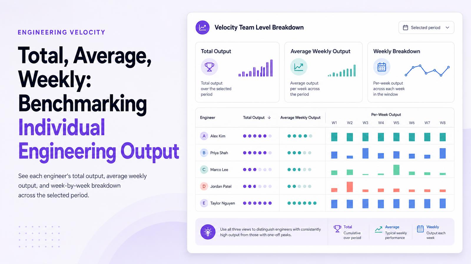
The Velocity Team Level Breakdown table shows each individual contributor's output score broken into three views: Total output over the selected period, Average weekly output, and the per-week breakdown across each week in the window. This per-engineer, per-week granularity makes it possible to distinguish engineers with consistently high output from those with one high-output week and several low ones, a distinction that aggregate totals erase.
Why it matters
Per-engineer output data is the foundation for two high-value decisions engineering leaders consistently need to make: identifying power users whose workflows others should replicate, and identifying engineers where AI tool investment isn't translating into output gains and additional support is needed. Weekly granularity makes both more precise, a drop in output in the week of a platform incident is different from a sustained multi-week decline, and the table makes that visible without requiring manual investigation.
The Larridin angle
The combination of Total, Avg, and weekly output in a single row per engineer makes performance pattern recognition immediate, consistent producers, spike-and-drop engineers, and genuinely improving or declining trajectories are all visible in the same view without building a separate analysis.
Related Velocity Metrics
Common questions
What does the Velocity Team Level Breakdown table show?
The table displays each engineer's output score in three views: total output over a selected period, average weekly output, and a per-week breakdown.
Why is per-engineer output data important for engineering leaders?
It helps identify power users whose workflows should be replicated and engineers who need more support due to AI tools not translating into output gains.
How does weekly granularity in output data benefit decision-making?
It allows leaders to differentiate between temporary drops in output and sustained declines, aiding in precise decision-making without manual investigation.
How does Larridin's table aid in performance pattern recognition?
By combining total, average, and weekly outputs in one view, it makes recognizing consistent producers and identifying performance trends immediate.