

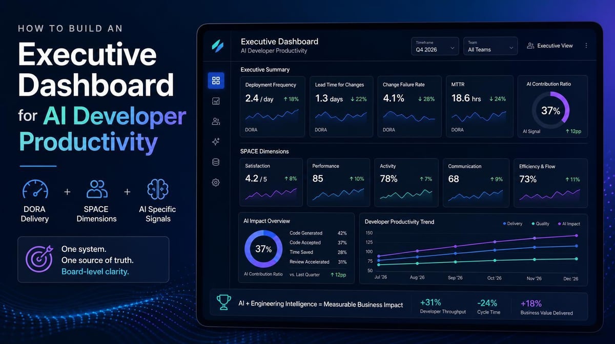

PR volume and deployment frequency are up, but the roadmap is still slipping. The numbers may be accurate and still fail to answer the question leadership cares about: Is AI improving delivery, quality, and business value at a defensible cost?
Key Takeaways
- An executive AI developer productivity dashboard needs a connected view of delivery, quality, adoption, proficiency, spend, and business value. A collection of vendor usage reports can’t answer the important questions.
- DORA and SPACE provide useful foundations, but neither attributes outcomes to AI-assisted work. Leaders also need AI code share, code durability, complexity-adjusted throughput, and cost data.
- The dashboard should help leaders decide where to expand AI investment, where to improve proficiency or governance, and where rising activity is masking rework or cost.
Why Scattered Tool Dashboards Don’t Add Up to an Executive View
Most engineering organizations already have plenty of data. GitHub Copilot, Cursor, Claude Code, and other tools report usage within their own products. CI/CD systems show delivery performance. Finance sees invoices, while engineering leaders see pull requests, deployments, and incidents.
The problem is fragmentation. Tool dashboards rarely show whether usage changed delivery outcomes, whether code quality held up, or whether the organization generated enough value to justify the full cost.
Each measurement framework also serves a different purpose. DORA’s current model uses five software delivery metrics spanning throughput and instability. The SPACE framework broadens the view across satisfaction, performance, activity, communication, and efficiency. Both reinforce the same principle: developer productivity can’t be reduced to one activity count.
AI adds another attribution problem. A deployment may include human-written code, inline AI assistance, and autonomous agent output. Without separating those inputs, executives can see that delivery changed but not whether AI caused the change, whether the result was durable, or what it cost.
The 4 Layers of an Executive AI Developer Productivity Dashboard
Layer 1: Delivery and Quality Outcomes
Start with delivery performance, not code-generation activity. Deployment frequency and change lead time need to sit beside change fail rate, deployment rework rate, and recovery time.
For AI-assisted teams, add:
- AI code share: How much committed work involved AI assistance?
- Complexity-adjusted throughput: Did the team complete more meaningful work or simply generate more small changes?
- Code durability: How much AI-assisted code survives 30 or 90 days without being reverted or substantially rewritten?
- Review and rework burden: Did faster generation shift the bottleneck to review, testing, or remediation?
Larridin’s Developer AI Impact Framework connects adoption, code share, throughput, quality, and cost so leaders can interpret delivery changes in context.
Layer 2: Adoption and AI Proficiency
Seat counts show access, and weekly active users show basic adoption. But neither tells leadership whether engineers have integrated AI into useful workflows or developed the proficiency to generate reliable outcomes.
Segment adoption by team, role, tool, and use case. Distinguish occasional users from engineers who use AI consistently for work that affects delivery. Show proficiency beside adoption so leaders can see where enablement, workflow redesign, or stronger guardrails may create more value than additional licenses.
Larridin’s AI Adoption dashboard provides team-level adoption, usage, cost, and governance visibility, while AI proficiency adds the capability lens.
Layer 3: Spend and Efficiency
Leaders need total AI coding cost by tool, team, and use case, including seat licenses, usage-based charges, and agent activity.
Pair cost with durable output, delivery improvement, and quality. Also surface idle licenses, sudden usage spikes, and teams whose costs are rising without a corresponding improvement in outcomes.
Token Spend & Insights consolidates AI spend across tools and agents, giving finance and engineering a shared cost view.
Layer 4: Business Value
The final layer connects engineering signals to the outcomes executives fund: roadmap progress, product delivery, customer impact, risk reduction, and financial return.
It should show whether AI-assisted work helped teams deliver important initiatives faster while maintaining or improving quality. It should also expose tradeoffs, such as higher deployment frequency paired with missed roadmap commitments or shorter lead time paired with more rework.
Larridin’s AI Impact platform connects AI activity to engineering productivity and business outcomes, turning adoption data into evidence leadership can use for investment decisions.
How to Make the Dashboard Useful at a Glance
A board-level dashboard should emphasize decisions, not exhaustiveness.
- Show trends, not isolated snapshots.
- Pair speed with quality.
- Segment before aggregating. Company-wide averages can hide major differences among teams.
- Surface exceptions and actions. Highlight cost overruns, quality regressions, proficiency gaps, and the owner of the next step.
The dashboard should help an executive answer four questions quickly:
- Is AI improving delivery without creating disproportionate rework or risk?
- Which teams are using AI effectively, and where are adoption or proficiency gaps limiting value?
- What is the total AI investment, and which tools and use cases are producing the strongest return?
- What changed since the last reporting period, and what decision does leadership need to make?
Frequently Asked Questions
Why aren’t DORA metrics enough as the primary AI developer productivity measure?
DORA measures software delivery performance. It doesn’t identify which work was AI-assisted, how deeply teams use AI, what the tools cost, or whether AI-generated code is durable. DORA is still valuable, but AI attribution, quality, adoption, proficiency, and cost provide the context executives need.
What is AI code share, and why does it belong on the dashboard?
AI code share is the portion of committed work associated with AI-assisted development. It’s a context metric, not a performance score. Paired with delivery, quality, and cost signals, it helps leaders see whether rising AI involvement corresponds with better outcomes.
How often should an executive AI developer productivity dashboard refresh?
Operational data should refresh often enough for engineering and finance leaders to catch cost spikes, quality regressions, and adoption problems before they compound. A summarized executive view can be reviewed monthly, with a more strategic version prepared for quarterly or board reporting.
Which frameworks should be combined for a complete executive view?
Use DORA for software delivery performance and SPACE for the broader, multidimensional productivity perspective. Then add AI-specific measures for attribution, adoption, proficiency, code durability, complexity-adjusted throughput, spend, and business value. The goal is a connected measurement system, not a stack of unrelated framework dashboards.
Build the Executive AI Productivity Dashboard Leadership Needs
Larridin connects AI adoption, proficiency, spend, engineering outcomes, and business impact in one executive-ready measurement system. Leaders can see where AI is creating value, where risk or cost is building, and what to do next.
Book a discovery call to see the executive dashboard in action.