


Your team uses AI tools daily. Can you show stakeholders and upper management which ones actually drive business value?
Key Takeaway
According to Gartner, organizations that run regular AI system assessments triple the likelihood of achieving high value from GenAI. An AI dashboard turns usage data into actionable insights, providing real-time visualization of key data.The AI dashboard connects AI tools to business outcomes stakeholders can understand.
Quick Navigation
- Why Build Dashboards for AI Usage
- Essential Metrics to Track
- How to Build Dashboards Step by Step
- Best Practices for Dashboard Design
- Turning Dashboard Data Into Action
- Speeding Dashboard Creation
Key Terms
- AI Dashboard: A visual display of key metrics and data points about AI tool usage, adoption, and business impact in real-time.
- Data Visualization: Charts, graphs, and interactive displays that transform raw datasets into easy-to-understand visuals such as bar charts and widgets.
- Key Performance Indicator (KPI): A specific metric used to measure success, such as usage frequency, adoption rate, or business value generated.
- Actionable Insights: Data analysis that suggests clear next steps and decisions, beyond raw numbers.
- Real-Time: Data that updates continuously, showing current activity rather than historical summaries.
Why Build Dashboards for AI Usage
Business dashboards connect data sources across AI tools and present key metrics stakeholders understand. Such dashboards can be used to track internally created tools as well as vendor offerings, which is very helpful when you face a “make vs. buy” decision. .
According toMicrosoft Copilot Analytics, dashboards provide transparent insights into AI impact. Teams use interactive dashboards to track usage trends, compare performance, and optimize deployment.
Dashboard software is the presentation layer. The harder part of the effort is collecting the data displayed on the dashboard - consistent, cross-platform AI usage data - and tying it to outcomes. This often requires data engineering effort.
Without dashboard creation, data teams build endless custom reports. Such ad hoc reports not only cause excessive work for both business analysts and data engineering teams; they are highly likely to be inconsistent and even inaccurate.
Unlike ad hoc reports, dashboards have enduring value. Research shows AI dashboards help decision-makers find patterns and improve task performance, especially when dashboards are interactive and designed for decisions.
Essential Metrics to Track
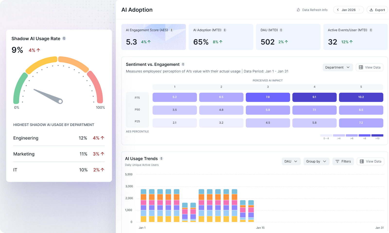
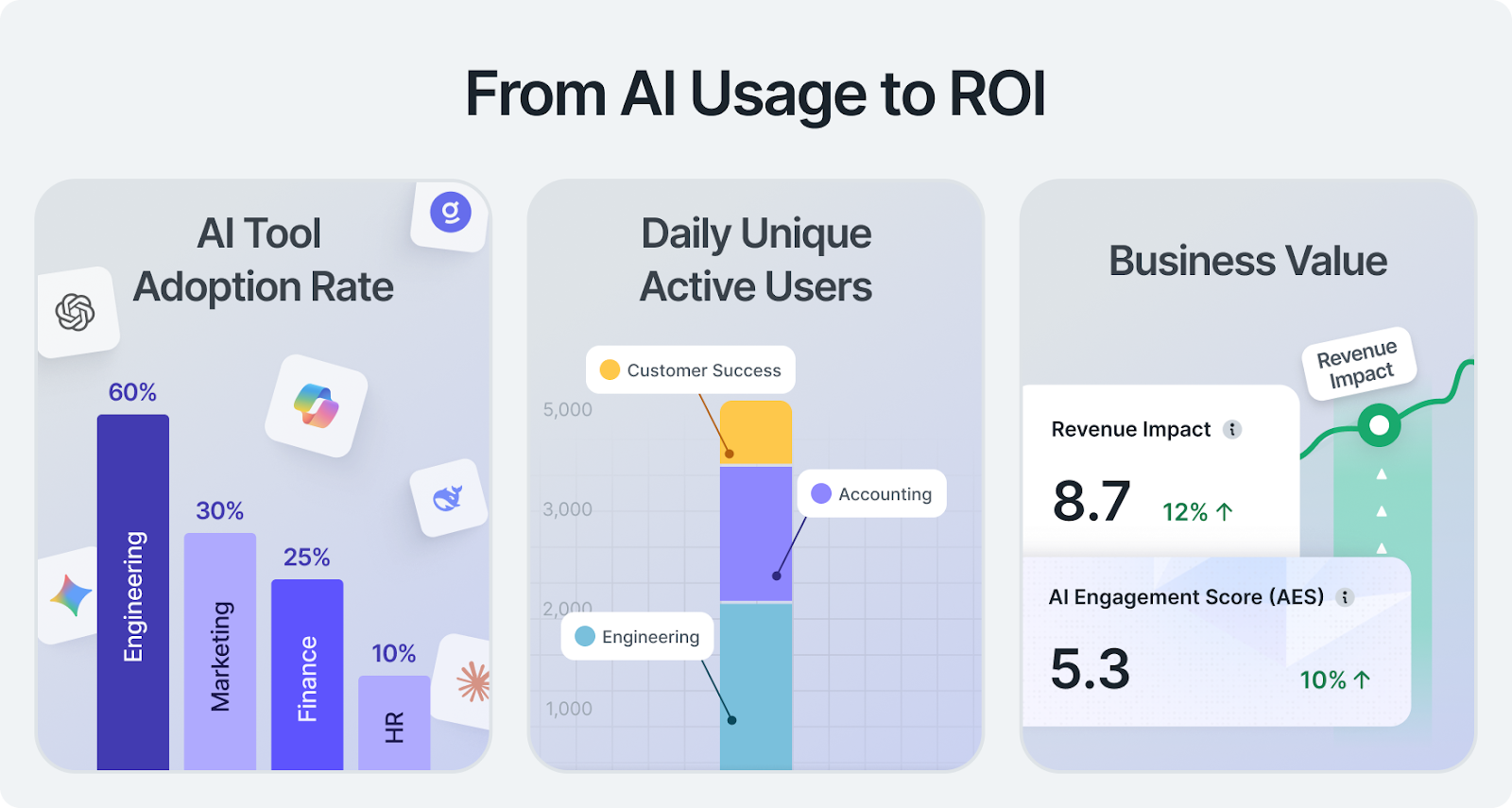
We suggest focusing on five to seven core metrics with documented definitions. Widely used indicators include daily active usage, session frequency, and adoption rate - company-wide and per department or team. Also monitor time saved, productivity improvements, and other business outcomes from AI-powered automation. Connect AI usage to spending through cost per team and cost per workflow to create ROI metrics per AI tool used.
How to Build Dashboards Step by Step
Building an AI dashboard doesn’t require technical expertise if you follow a structured approach. Modern dashboard tools and templates streamline dashboard creation.
1. Connect Your Data Sources
Identify where AI usage data lives. Most organizations have data scattered across multiple systems. We have routinely found that organizations tend to find 3 times more AI in use than they currently monitor. Connect data sources one at a time. Start with your most reliable datasets, then expand. Tools like ScoutTM have real-time dashboards that track AI usage.
Use AI tools with API access for automated data ingestion. Platforms such as Microsoft Copilot, OpenAI, and Gemini offer APIs or admin reporting that can feed usage data into analytics dashboards. If you create AI tools internally, make sure they have observability of this kind built in. Ensure you are capable of detecting if people are using corporate versus personal accounts.
2. Choose the Right Dashboard Tools
Select tools based on your needs. Open source options such as Metabase work for teams comfortable with SQL. Metabase also supports a query builder for non-SQL users. No-code platforms such as Tableau or ThoughtSpot offer AI-powered features including natural language Q&A and search-based analytics, which can help stakeholders explore metrics without writing queries.
Consider whether you need business intelligence depth or simple KPI tracking. Some teams want interactive dashboards for analysis. Others need always-on displays showing key metrics.
3. Use Templates and AI Features
Start with templates instead of a blank canvas. Dashboard templates help standardize common use cases, so teams can reuse layouts and keep metrics consistent. For example,Power BI report templates let you save a reusable .pbit structure.
AI features can speed up build time and make dashboards easier to use. In Power BI, Copilot cancreate and edit reports with natural language prompts and generatesummaries of what a report shows.
Modern AI dashboards often use an LLM-powered AI assistant to turn plain-language requests into widgets, charts, and narrative summaries that help stakeholders interpret results faster.
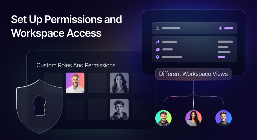
4. Set Up Permissions and Workspace Access
Control who sees what data. Set permissions by team, role, and department. Some stakeholders need full access to datasets; others should see only high-level summaries.
Create different workspace views for different audiences. Executives want business outcomes. Data teams need technical details. Use AI-powered tools to automatically generate appropriate views for each stakeholder group.
Best Practices for Dashboard Design
Good dashboards balance comprehensive data with simple presentation. Follow these practices to build dashboards that people actually use.
Start Small and Iterate
Begin with five to seven metrics displayed through clear data visualization. Start with one or two teams that already use AI in real workflows, then expand once the metrics and definitions hold up. Roll out your dashboard to a small group first, gather feedback, and optimize based on real-world usage.
Make It Actionable
Every metric should answer the question, "So what?" Use AI-generated summaries to explain what numbers mean and suggest next steps. Add context showing whether trends are good or bad. Dashboard widgets should guide decisions, not just display data.
Keep It Current
Update frequency matters. Set up automation so datasets refresh without manual work. Use AI models to detect anomalies and alert stakeholders when metrics change significantly. Real-time monitoring beats monthly reports.
Document and Train
Create docs and FAQs explaining what each metric means and how to use the dashboard. Good user experience includes training stakeholders on interpreting data and taking action. Make sure teams understand the business value behind the numbers.
Turning Dashboard Data Into Action
According toIBM Turbonomic, effective dashboards should show key metrics and the impact of automation decisions, so teams can guide optimization instead of just reporting activity. Use your AI dashboard to identify which AI models and AI systems drive results, to spot bottlenecks in workflows, to optimize pricing and resource allocation, and to streamline processes based on usage patterns.
Business intelligence comes from acting on insights, not just collecting data. Set up alerts for key thresholds. When adoption drops or costs spike, stakeholders get notifications with suggested responses.
Create feedback loops between dashboard data and AI strategy. Use AI features to summarize trends, surface anomalies, and flag changes worth investigating. Review and act on those signals in a regular cadence.
Remember that building an AI dashboard is the first step. The goal is creating a workspace where data teams, business leaders, and stakeholders collaborate on better decisions. Use data points to drive action, not just reports.
Speeding Dashboard Creation
Some organizations are sure that they want to create AI dashboards internally. If your organization has experience building dashboards, doing the data engineering work needed to connect them to data sources, and managing the results that dashboards deliver, this may be a good path for you.
However, even if doing it yourself is your usual approach, you can inspire, benchmark, or hot-wire your internal efforts by checking out Larridin Scout™. Consider reaching out for a demo.
Most organizations, however, are open to external offerings when they add value. If you are wondering whether AI dashboards from a leading company in the space can deliver value, save your organization time and money, and help you work with AI at the highest level possible, you will benefit from checking out Larridin.
Ready to leverage AI dashboards that stakeholders actually use?